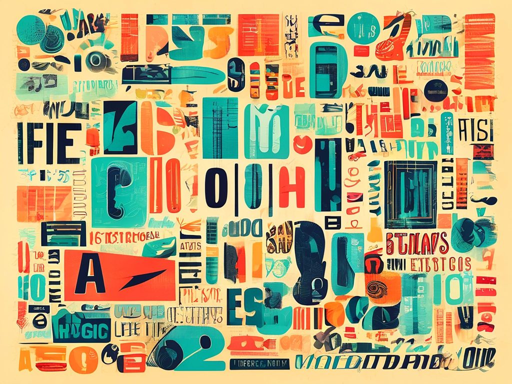
This makes typography far more than a visual detail. It is one of the strongest carriers of brand personality. A typeface can make a business feel authoritative, accessible, premium, technical, traditional, playful, editorial or institutional before the audience has consciously processed the message. Recent creative analysis has made the same point clearly: typography shapes perception, communicates values and gives a brand a recognizable voice across its communications. (Creative Bloq) In a digital environment where brands appear across more channels than ever before, the way words look has become almost as important as the words themselves.
Typography gives the brand a voice before language does
Every brand speaks through language, but typography determines how that language is first perceived. The same sentence can feel elegant, aggressive, warm, corporate, youthful or unreliable depending on the typeface, spacing, scale and hierarchy used to present it. This is why typography cannot be separated from brand strategy. It influences tone before copywriting has the chance to explain anything.
A financial institution, for example, may need typography that communicates stability, clarity and trust, while a technology company may require a system that feels precise, efficient and contemporary. A hospitality brand may need warmth and approachability, while a luxury brand may depend on restraint, contrast and space. Adobe’s own guidance on typography and branding describes this relationship directly, noting that typography helps communicate a brand’s personality and visual identity by expressing specific values and characteristics. (Adobe) The typeface is not decoration around the message. It is part of the message.
The logo is remembered, but typography is experienced
Businesses often overestimate how often their audience interacts with the logo and underestimate how often they interact with type. A logo may appear in a header, a profile image or the corner of a document, but typography carries most of the actual communication. It structures the website, explains the service, guides the user through a form, organizes a presentation and gives rhythm to every social media post.
This is why weak typography can quietly damage a brand even when the rest of the identity appears correct. A strong logo placed next to inconsistent headings, poor line spacing, generic templates or unreadable text loses much of its impact. The brand may look acceptable at first glance, but the experience feels less considered, less professional and less trustworthy over time. Typography is where identity becomes daily use, and daily use is where brand perception is truly formed.
Typography creates consistency across touchpoints
A modern brand rarely lives in one place. It appears on websites, landing pages, social media graphics, pitch decks, brochures, menus, internal documents, digital ads, video captions, email signatures and product interfaces. If each of these touchpoints uses typography differently, the brand begins to feel fragmented even when the logo and colours remain consistent.
This is why typography needs to be treated as a system rather than a single font choice. A strong typographic system defines how headlines behave, how body text is structured, how emphasis is created, how hierarchy works across formats and how the brand adapts between formal, promotional, informational and conversational contexts. In practice, this gives teams the ability to create different materials without making the brand feel different every time.
Consistency does not mean that every piece of communication must look identical. It means that every touchpoint should feel like it belongs to the same organization. Typography plays a critical role in that coherence because it creates a visual rhythm that audiences encounter repeatedly, often without consciously noticing it.
Readability is also a brand decision
Typography is not only about personality. It is also about access, clarity and usability. If users struggle to read a website, understand a service page, scan a presentation or complete a form, the brand experience becomes weaker regardless of how attractive the design may be. Poor readability creates friction, and friction affects trust.
This is especially important in digital environments, where attention is limited and users often scan before they read. Font size, line height, contrast, spacing and hierarchy all influence whether information feels easy or demanding. A brand that invests in good typography is not only improving its visual identity; it is improving the customer’s ability to understand, decide and act. That connection between readability and business performance is often underestimated, yet it is central to UX, conversion and customer experience.
Why typography matters even more in the age of templates and AI
The rise of design templates, automated content tools and AI-generated creative assets has made it easier for businesses to produce large volumes of visual material. It has also made many brands look increasingly similar. When everyone has access to the same tools, the same layouts and the same visual shortcuts, differentiation depends less on production and more on judgment.
Typography is one of the areas where that judgment becomes visible. Choosing and applying type well requires an understanding of tone, context, usability, hierarchy and brand behaviour. A template may provide a layout, and an AI tool may suggest a visual direction, but neither can automatically determine whether a typographic system truly expresses the character of a specific brand across real business touchpoints. Without strategic direction, typography becomes generic. With strategic direction, it becomes one of the most recognizable assets a brand can own.
The role of The Design Agency
The Design Agency approaches typography as a strategic element of brand identity, not as a final stylistic decision. Before selecting typefaces or defining typographic rules, The Design Agency examines the personality of the brand, the expectations of its audience, the environments in which the identity will appear and the business objectives the communication needs to support.
Through brand strategy, visual identity, digital design and creative direction, The Design Agency helps businesses build typographic systems that work across websites, social media, presentations, campaigns, printed materials and customer-facing communications. The goal is not simply to choose a beautiful font, but to create a consistent visual language that strengthens recognition, improves readability and makes every brand interaction feel more intentional.
Typography is where identity becomes language
A brand is not built only through symbols. It is built through repeated moments of recognition, and many of those moments happen through text. The way a headline appears, the way a message is structured, the way information is organized and the way reading feels all contribute to how people understand a business.
That is why typography deserves a more central place in branding conversations. It is not a secondary layer added after the identity has been created. It is one of the ways the identity speaks, behaves and becomes recognizable in everyday communication. For businesses trying to build trust, clarity and differentiation, typography is not a detail. It is a strategic asset.